Example feedback response
Extensive response
Hey! I really like the creativity and effort you put into it, I can definitely see the resemblance to the original work.
This is what I would change:
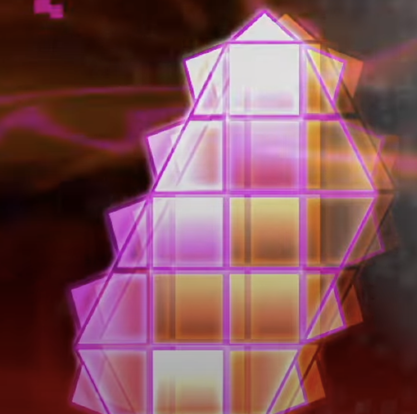
- The use of colors in the fg and bg most of the time are the same, I'd try to make the bg darker and the fg lighter to give a more electrical feeling and improve clarity.
- The structures and atmospheric deco are a bit messy (specially when it flashes), so I'd recommend for them to have a more subtle pulse or an off-time/transition-like color change.
- The use of both orange and yellow on different layers is great, but the area fade might be too big. It reduces the chaos, but it sacrifices a primordial element (see images 1 and 2).
- The constant rotation of the structures' copies diminish the attention put into the UI and gimmicks such as the fake orbs and split portals.
To sum up, I think the main problem to fix here is the abundance of area moves applied to the structures and the lack of distinction between colors in independent layers.