Sonic Adventure: 3D Design & E-102 Gamma Analysis
- Share this discussion
- Copy link
- Share on X (Twitter)
Summary
The Theory Development & Experiment Lab presents a detailed look at the transition of Sonic the Hedgehog from 2D to 3D design in Sonic Adventure. This analysis examines the game's unique aesthetic choices and provides a deep dive into the character arc of E-102 Gamma. By exploring why this robot remains a standout playable character, the community gains a better understanding of effective narrative and mechanical design in early 3D gaming.

I will be covering the stylization update of Sonic the Hedgehog in Sonic Adventure, as an added bonus I will discuss E-102 Gammas arc and the various characterizations within the extreme deviation from the normal anthropomorphic characters to the first and arguably most likeable robot playable character.
To begin with, Sonics early 2D years is heavily stylized in a cartoon fashion, relying heavily on pixel aesthetics within the art to express and develop immersion without jarring visual cues and design. Within any progression to 3d, the half cartoon half anthropomorphic realism is greatly handicapped due to the nature of the clash between more sensible aesthetics and connotations of representation with realism, especially with gameplay in mind (a clear example being Mario 64 where Mario's feet or hands enlarge during kicks and punches to accentuate the kinetic impact and hitbox). Sonic team however had a unique and interesting method of developing Sonic into the 3d port where transitioning the initial "chibi-classic" sonic may have been not only difficult but taxing on the systems of the time (the Dreamcast), age. During development Sonic had been around for almost 6 years and they capitalized on this by entirely altering his looks, his limbs and torso growing longer while the head became less circular. A bold move no doubt but...how would this fair with the already established fanbase?
I present to you "exhibit A of transitory stylization".

Sonic had many games to build characterization and stylization from during the development of Sonic Adventure. However, the consistent portrayal of sass, speed, and self confidence (though more projected by the player and game design) ultimately became the guiding principle for this new rendition of Sonic. The cover art is the best example of this, ultimately justifying and normalizing the transition into 3d for years to come.
The art is a modern homage with both artistic confluence and well used color balance. Sonics shoes have been given a buckle adding yellow to the red, blue, and white majority balancing the contrast between sonics skin tone and white used. The logo itself adopts a mixture of sky blue and orange to set it apart from the art without becoming a noisy distraction adding a level of depth to the horizon line and acting as a tone foundation for Sonic. The color choices are only further benefited from the usage of white with a level of opacity and sunrise and sunset tones of a more red and purple nature complimenting the orange and blue, while below the horizon line a saturated light blue into dark adds a clear horizon line to juxtapose structure to the perspective. These colors when compared to the opening scene and palette choices of the previous Sonic games is a perfect compliment with the exception being Sonic Pinball which heavily leaned into darker and more purple tones.
Stylistically Sonic has been updated with signs of age, this alteration can be rather jarring in a formal sense with comparison to previous iterations. Sega however, shows sublime decisions to mitigate the awkwardness of the transition. Sonic is depicted here with the sass and confidence that players had come to expect from navigating spikes and badniks while running at breakneck speed. His posture is flowy and is spherical creating an ease of transition in reference to the spherical body shape of the 2d era. The white wispy vignettes add the illusion of speed while also drawing attention to the angular positioning of Sonic's limbs and posture, a portrayal that minimizes the new and longer design while also fostering familiarity in the concepts fans previously knew and internalized. His feet are positioned to clearly indicate momentum with reference to the running animations of the previous generations and Sonics characterization has received a simple effective update. No longer a youth, his sass is not a simple humble expression of presence with the act of finger wagging, his prior presence is now replaced with a grin of confidence and poise, his fingers pointed outward in a teenager like awareness of suave carefree mindfulness are an update and homage to his finger wagging, a demonstration of acknowledgement to the less than positive situations he tends to be confronted with. These all coalesce into a stylistically cohesive update that neither destroys fans perception or entirely alienates them with dissonance. New fans were likewise given a stylistically apt and valid design of aesthetics acceptable for the time that was neither unwelcoming nor entirely foreign beyond the medium and character. These traits are the reasons that Sonic adventure's cover art is by far one of the most well thought out presentations as well as effective within video game development history.
As a follow up I'd like to heavily lean into the demonstration of how these aren't given successes using the best 2.5D example and how the exact obstacles avoided were artistically detrimental to another release "Sonic 3D Blast'
As a follow up I'd like to heavily lean into the demonstration of how these aren't given successes using the best 2.5D example and how the exact obstacles avoided were artistically detrimental to another release "Sonic 3D Blast".
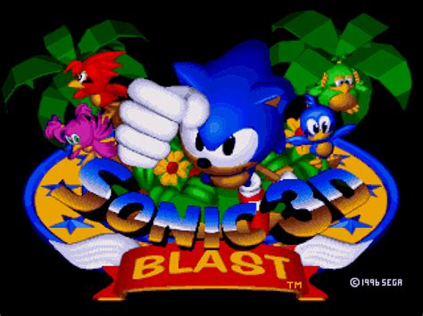
From left to right: Cover art, title screen art, in game.
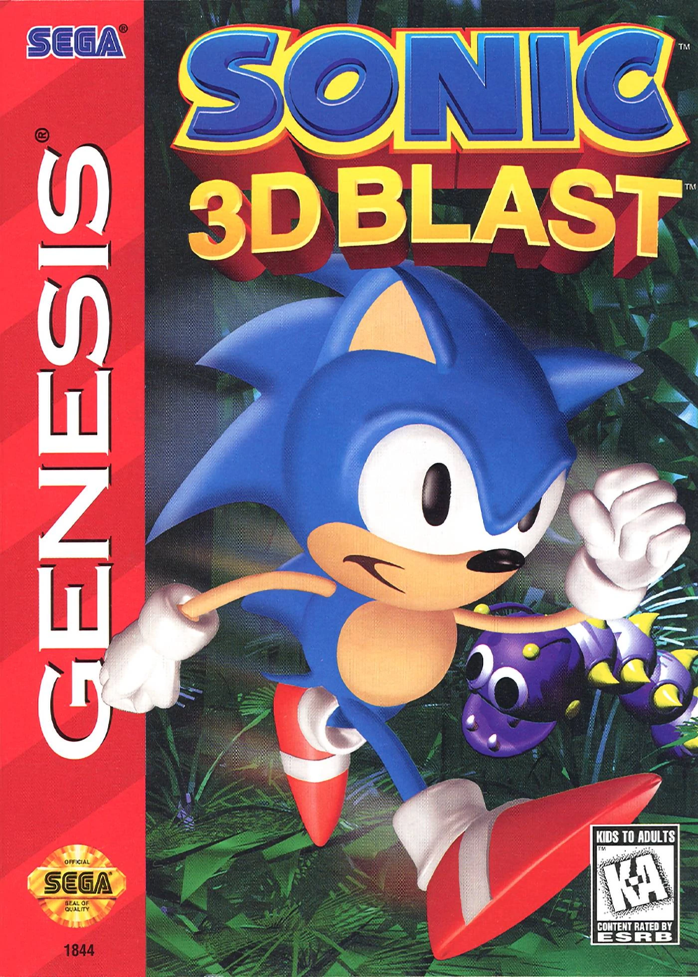
The design of the cover art is atrocious and unsightly. The developers wanted to draw attention to the new engine and rendering possible and the design of the cover art became a reflection of that. Sonic's cartoonish proportions became heavily accentuated in 3d rendering and foster an uncanny valley effect that is not only cumbersome but inaccurate to the models design. To it's praise, if they had held to the in game model, it is more likely that the cover would look awkward and even more unfocused than the final product. The foreground and background are muddled due to the lack of 3dimensional perspective with the generated models. Even the motion blur has become a clumsy and amateur method of creating an artificial correlation to Sonic's speed.
The title on the other hand leans into the game engine well and does it's diligence at not only portraying the games general aesthetics but keeping to the characterization while introducing 'potential characters' and the emphasis of a different sort of setting.
It prepares the player for a top down view and gameplay that is vaguely more 'fairy tale storybook' in speed, an accurate summation of Sonic 3D Blast's generally slower move speed in proportion to the smaller levels.
On this same topic of the in game renders, Sonic here is shown to have all the issues that I illustrated earlier in being represented in 3D, his limbs have grown longer out of necessity, and while his shape is attempting to stay within the realm of 'homage to the previous generations' the startup intro video also clearly has differences in proportions.

A section of the intro that demonstrates this adequately (warning for those who are sensitive to jump scare like movement).

As a quick expose of how Sonic Spinball differs drastically from the general color pallete of the rest of the series, I went and looked for any examples of other Sonic games that had similarly clashing color schemes.
Title card, level 1, and level 3.
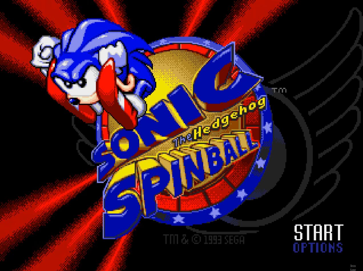
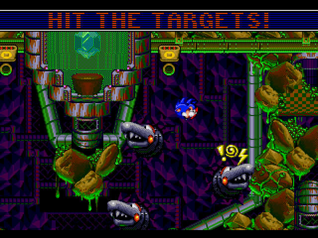
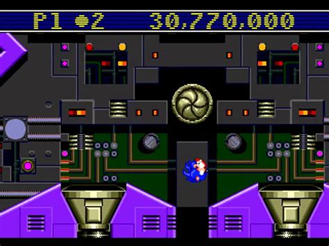
These stray away from the mostly blue undertones and heavily lean into purple and red, an extremely glaring clash of the usual palettes of brown blue and red that tend to define the series.
Level 2 and the final level, 4, likewise show none of the pastel coloration that is generally known of the series and are extraordinarily uncommon save for one example that follows suit while still leaning into pastel colors, Sonic Labyrinth.
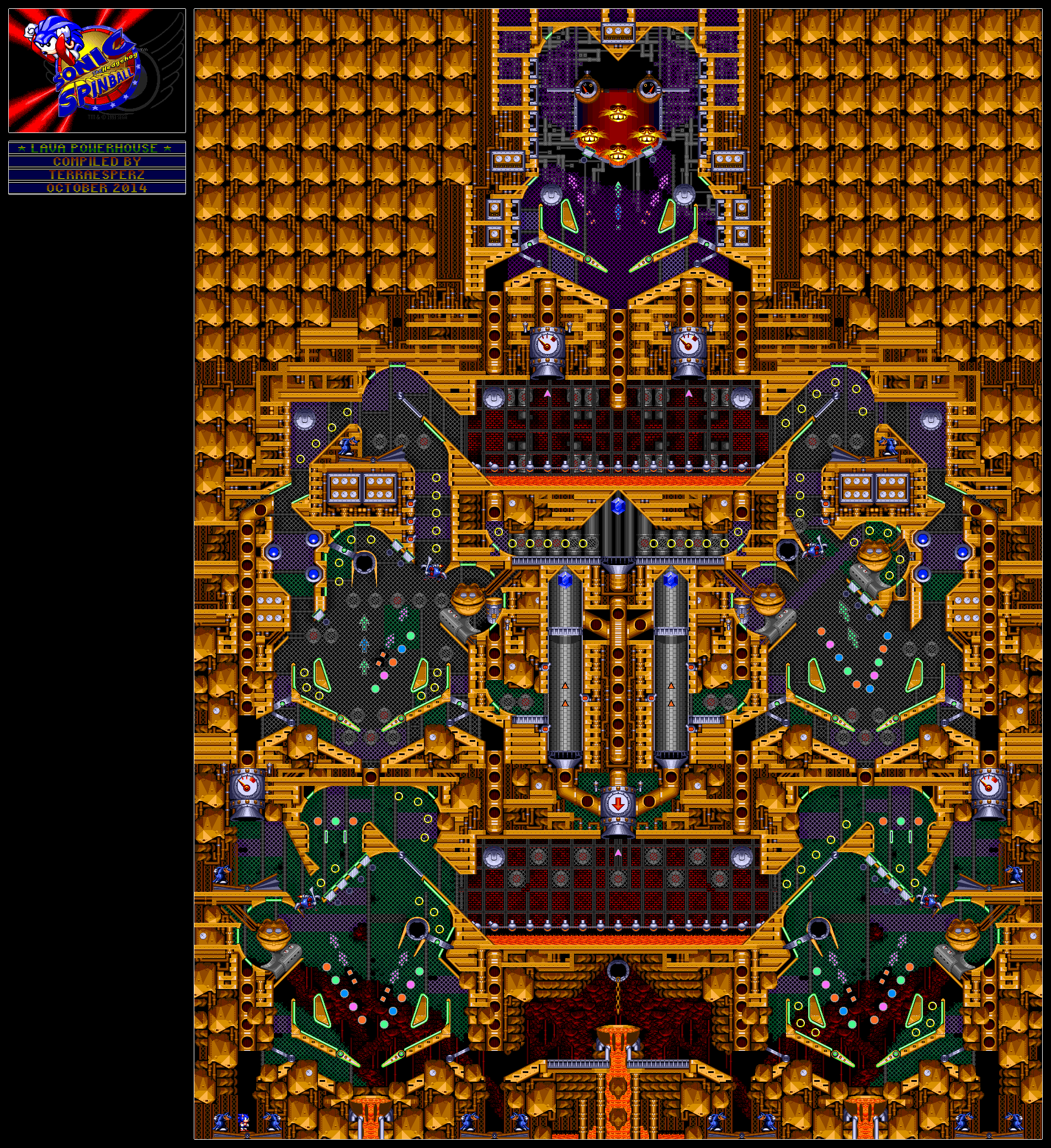

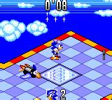
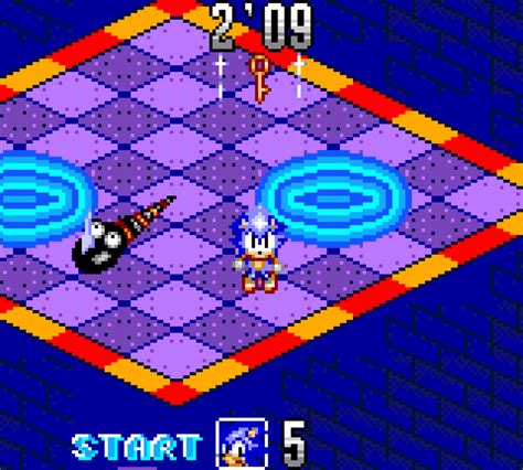
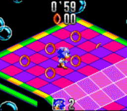
While I have never personally played this game, let alone heard of it, it is clear to see that it is using a slightly darker palette to the main series than most.

The levels follow this same design and use a slightly pastel that focuses on complimentary to dark blue colors.

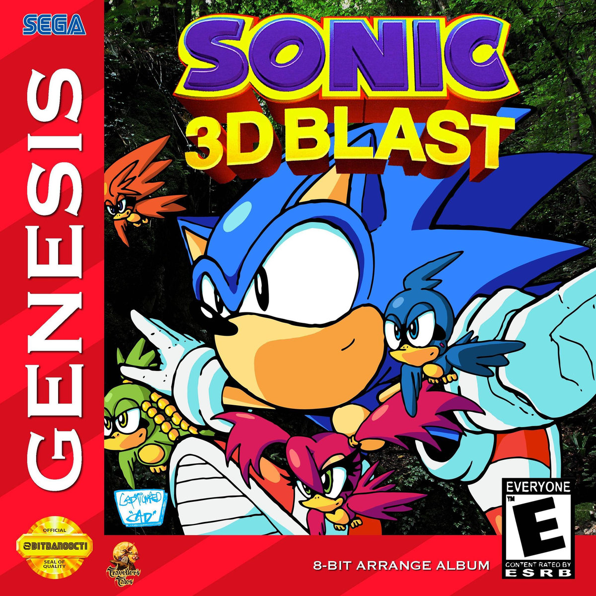
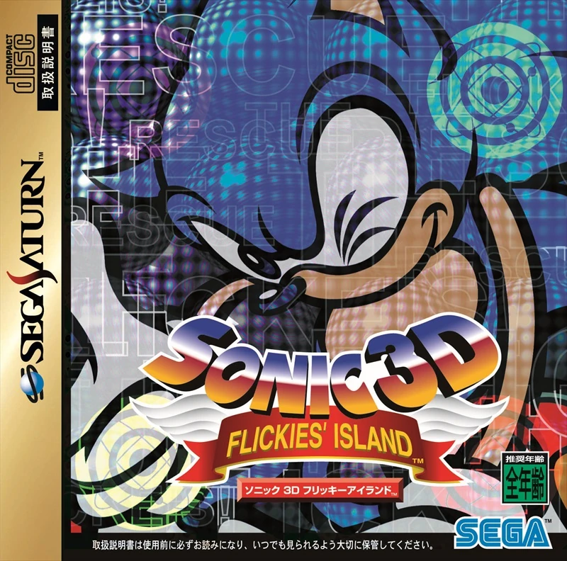
All of this however is not to say that 3D blast couldn't have had decent cover art, to my surprise while looking through this information and for reference images to use I found what appears to be a fan rendition of the title that seems effective. Additionally while a little oversaturated and perhaps too uninformative, Japans cover for the Sega Saturn was similarly effective by not attempting to showcase the engine. I think there is an argument to be made that the models for the 3d(2.5d) engine are just close enough to familiarity to potentially not be jarring.
Fan art, Sega Saturn official JP cover.
E-102 Gamma, lots to cover and lots of material to reference.
Bonus: