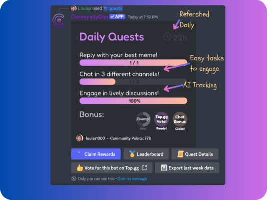
Make Rewards Clear in Campaign UI: Display the Reward Amount Instantly
Summary
If you want more people to complete your quests, don’t hide payouts. Display the exact reward amount prominently in the campaign UI—especially on the logo—and avoid fine print.
Reward campaigns and quests work best when users can understand the value quickly. A key takeaway is simple: make rewards clear in the campaign interface so people don’t have to hunt for details or read fine print.
Below are practical ways to improve reward visibility in quest or campaign UI, based on the video’s guidance.
Why reward clarity matters in campaign UI
When a campaign includes rewards, users should be able to answer one question immediately: “How much do I get?”
The video emphasizes that small clarity improvements can make a campaign more successful. The reason is straightforward—confusing presentation adds friction. If someone has to figure out the payout from confusing screens or hidden details, they may drop off before participating.
Making rewards clear reduces that friction by allowing users to understand the offer at a glance.
Show the exact reward amount prominently
If you’re giving out a set amount of money, the guidance is to display that amount prominently and clearly.
Instead of forcing users to search for the payout information, put the reward amount where it’s easy to see in the campaign UI. The goal is instant comprehension: users should not need to read fine print to learn what they actually receive.
Focus on speed and clarity:
- Make the reward amount visible right away
- Avoid burying the key number behind extra steps
- Ensure users can understand the payout without searching
Use a logo or image that communicates reward value at a glance
The video recommends using a visually appealing image/logo that communicates the reward value at a glance.
A practical approach is to include the reward amount directly in the logo or image used in the campaign UI. The point is that users can understand the value instantly—without needing to open additional details or interpret less obvious text.
In other words, the campaign visuals should do part of the “explaining” so users don’t have to.
Avoid “horrible UI” that requires reading fine print
One of the most direct warnings is against confusing UI that forces users to read the fine print.
If the interface is designed in a way where people must search around or carefully read to discover the reward details, it undermines the user experience. The video frames this as an avoidable problem: don’t make users work just to find out whether they’re actually receiving money.
To align with the takeaway, remove obstacles to understanding the reward:
- Don’t bury the reward amount in hard-to-find details
- Don’t rely on users reading small or unclear text
- Don’t create UI flows that require extra searching to learn the payout
How small UI changes can improve campaign success
The overall message is that small design tweaks can lead to better campaign performance. Specifically, improving reward visibility helps users make faster decisions.
The video’s recommendations point to a few concrete changes you can apply:
- Make rewards clear in the campaign UI
- Put the exact reward amount where people can see it quickly
- Use a pretty, branded image/logo that includes the reward value
- Avoid UI that requires reading fine print to understand the payout
Taken together, these changes reduce confusion and make the campaign feel more straightforward. When users immediately understand what they’ll receive, participation becomes easier.
Conclusion
If you want users to complete your quests or participate in rewards campaigns, don’t hide the payout behind confusing screens. The video’s guidance boils down to clarity: when you’re giving a set amount of money, display that amount clearly in the campaign UI—especially on the logo or image—so users understand the value instantly without having to read fine print.
Clear rewards lead to smoother decisions, and smoother decisions can make your campaigns more successful.